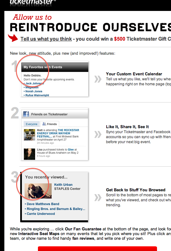
A couple of days ago I got this email from Ticketmaster announcing their new features. On a quick scan, something caught my attention, a couple of words clearly stood out:

It seems a bit weird, to say the least, that items under “My favorites” and “Stuff you browsed” belong to the same person, doesn’t it?
Some questions arise:
- Wich determiner is right, “my” or “your”?
- Should designers use personal pronouns on their interfaces at all?
- Do users detect this uncoherence or is it just a designer problem (thus, a non-existent problem)?
Because I’ve had this dilemma for quite a while now, I collected some opinions on the issue. Have you got any more? Your own, maybe? If so, please leave a comment.
My Computer. I’ve always hated this icon — its insulting, infantilizing tone. Even if you change the name, the damage is done: It’s how you’ve been encouraged to think of the system.
“My” also presents the potential for substantial confusion. Let’s say I’m interacting with a widget-selling site. And I have a personal area on the site, and it’s called, “My Account”. Then the system, when referring to me, must call me “I” and “My,” which is weird, because, well, it’s odd when reflexive possessive adjectives are used and you’re not in control (or should that be, “and I’m not in control”?)
Also, if I need to talk to The System for some reason (say, send email to the people who run it), how do I refer to it? Usually it’s “Contact Us”, but if I am “My”, than “Us” would be me as well, so that leaves “You” for The System, so it would be something like “Contact You” and, well, that’s weird, too.
Labeling stuff with “My” imitates the point of view of the user. It is as if the user has printed out labels and stuck them to various objects: My Lunch, My Desk, My Red Stapler. Except the user hasn’t done this; you (the site) did it for them.
Labeling stuff with “Your” instead reinforces the conversational dialogue. It is how another human being might address you when talking about your stuff. Even with MySpace, people say things like “I saw what you put on your MySpace.
if you succumb to the peculiar temptation of my, you just set yourself up for totally unnecessary inconsistency. And, should you decide to brand a whole section of your site with “My”, you aren’t really branding the experience at all. You are inviting your users to draw an analogy with something another company did over a decade ago. It’s a missed opportunity, and that sucks.